Shipping Small: What a Tiny Launch Taught Us About Scope
The listing
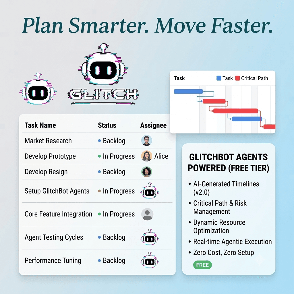
GlitchBot is listed on TinyLaunchpad, a directory for small and independently built products. The framing of the site — small things, shipped — turned out to be a constraint worth taking seriously when writing the entry.
Describing what exists
There is a habit in early-stage product writing of describing the roadmap in the present tense. Not dishonestly, exactly; more that the thing you are three weeks from shipping feels more real than the thing you shipped six months ago and have stopped noticing.
Writing an entry for a directory that explicitly celebrates small, finished things made that habit visible. Stripping out everything not currently working left a noticeably shorter description — and a more confident one, because every claim in it could be verified by clicking through.
The scope lesson
The exercise had a second effect we did not anticipate. Once the product was described purely in terms of what worked, the gaps were obvious in a way they had not been on our own roadmap. Several items we had been treating as important turned out to be things we wanted to have built rather than things anyone had asked for.
We cut three. Not because they were bad ideas, but because writing a plain description of the product made it clear they were not load-bearing for anybody's actual workflow. Roadmaps are very good at hiding this — everything on a roadmap looks justified because it is on the roadmap.
This is essentially the scope-control discipline we write about applying to client projects, turned inward. The mechanism is identical: an addition that is never priced against anything looks free. Our post on the failures that repeat covers the general version.
Small as a strategy, not a stage
The implicit argument of a site like TinyLaunchpad is that small is a legitimate end state rather than an embarrassing waypoint. We are not fully convinced of the strong version of that claim, but the weak version is clearly right: a product that does three things properly is more useful than one that does eleven approximately, and the pressure to move from the first to the second is mostly internal.
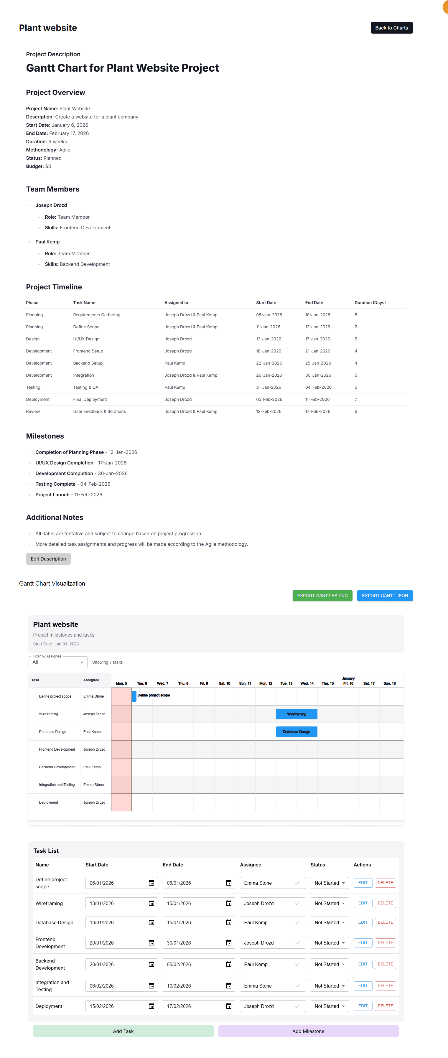
Concretely, this changed what we build next. The current focus is depth on plan generation — better dependency inference, better duration estimates — rather than breadth into adjacent categories. That is a less impressive-sounding roadmap and a more defensible product. You can see where that effort has gone in the Gantt chart guide, which documents the modelling the generator actually performs.
The three things we cut
Vague claims about cutting scope are easy, so here are the actual items and the actual reasoning.
A native mobile app. Long-assumed, never questioned. When we wrote down who would use it and for what, the honest answer was that project planning is desk work and the mobile use case was checking status — which the responsive web app already does adequately. Cut, with no regret.
A custom report builder. Requested twice, both times by people who wanted one specific report. Building a general report builder to satisfy two specific requests is a classic over-generalisation, and it would have taken most of a quarter. We built the two reports instead, in about a week.
Time tracking. This one was genuinely close, and we may revisit it. It was cut because it would put us in direct comparison with mature, entrenched tools on a feature where we would be visibly worse for a long time, and because nobody had asked for it — we wanted it because competitors had it. That is the worst reason to build something.
How to tell wants from needs on your own roadmap
The test that surfaced all three: for each roadmap item, name the specific person who asked for it and what they were trying to do when they hit the gap. Not a persona — a person, or a real support conversation.
Items with a real name attached tend to survive scrutiny. Items where the honest answer is "it seems like something a project tool should have" almost never do. That phrase turned out to be a reliable marker of a feature we wanted for the product's self-image rather than for any user.
The uncomfortable part is that this test is easy to run and most teams do not run it, because the answer is frequently that a favourite item has no advocate. It is much more pleasant to keep it on the roadmap where it looks justified by proximity to the other items.
What depth over breadth actually looked like
Cutting three features freed roughly a quarter. It went into dependency inference — specifically, making the generator better at working out which tasks genuinely block which, rather than producing a plausible-looking chain.
This is invisible work in a feature list and the single thing most likely to make a generated plan trustworthy. A plan with wrong dependencies is worse than no plan, because it produces a confident critical path that is simply incorrect, and users cannot easily tell. Getting that right does not add a bullet point to a comparison table, and it is the difference between a plan you can act on and a plan you have to check.
Whether that trade was correct is not fully settled — a comparison table with fewer rows does cost us in evaluations. But it is the trade that a small product should make, and writing a directory listing about what we had actually finished is what made it obvious.